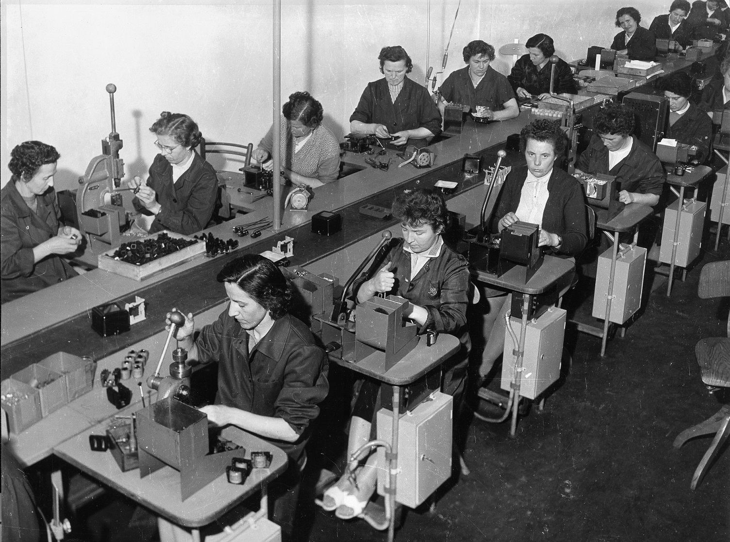
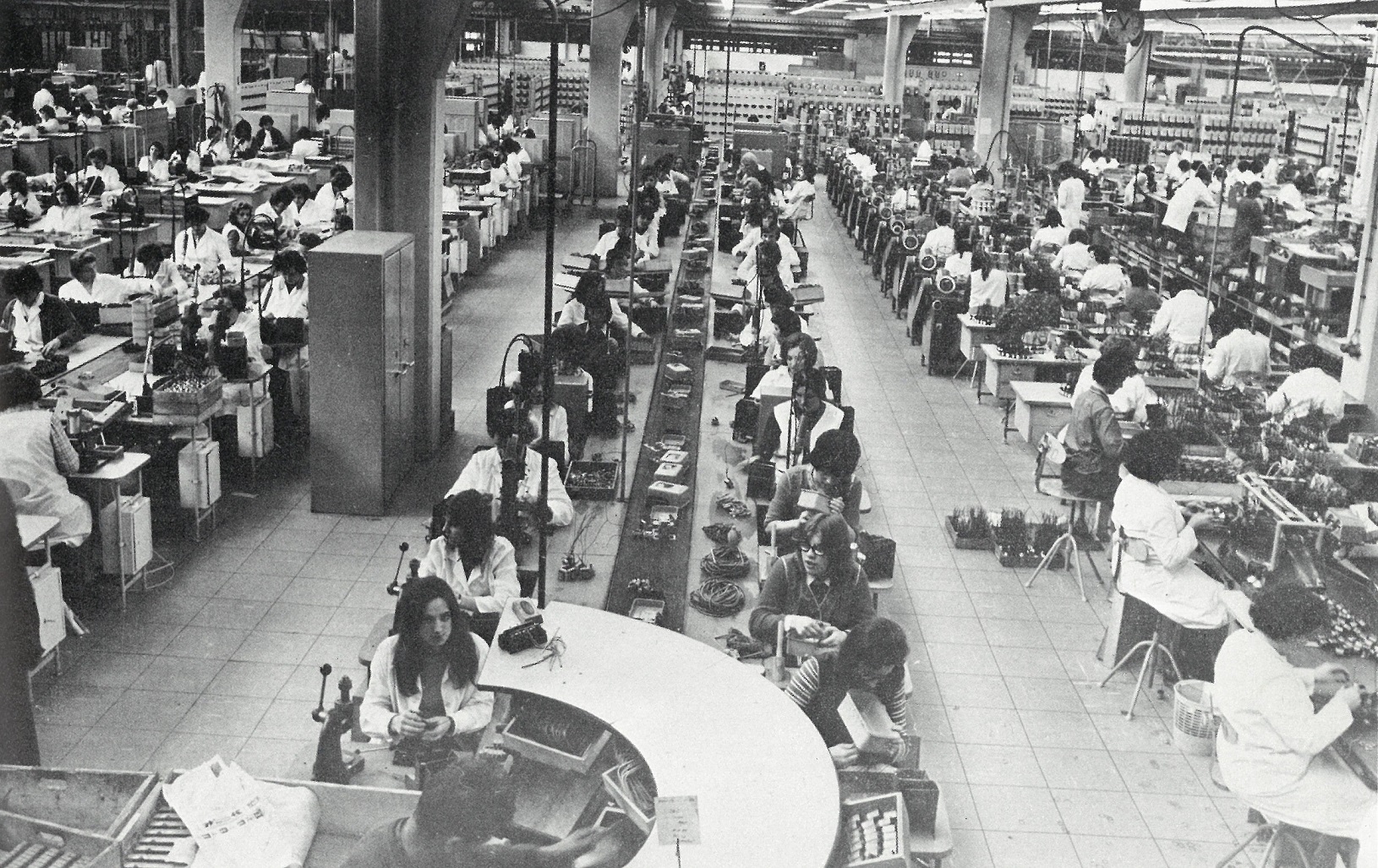
The name Iskra was proposed by Mirjan Gruden in 1946, symbolizing the beginning of a process and the potential for growth. Gruden envisioned the company’s future with the words: “The factory will evolve and grow; from a spark (iskra in Slovene) comes a flame, and may our Iskra ignite as well.” He further explained that “electrical engineers are constantly in contact with sparks; a spark is a symbol of a beginning.” Gruden also presented the logo draft.
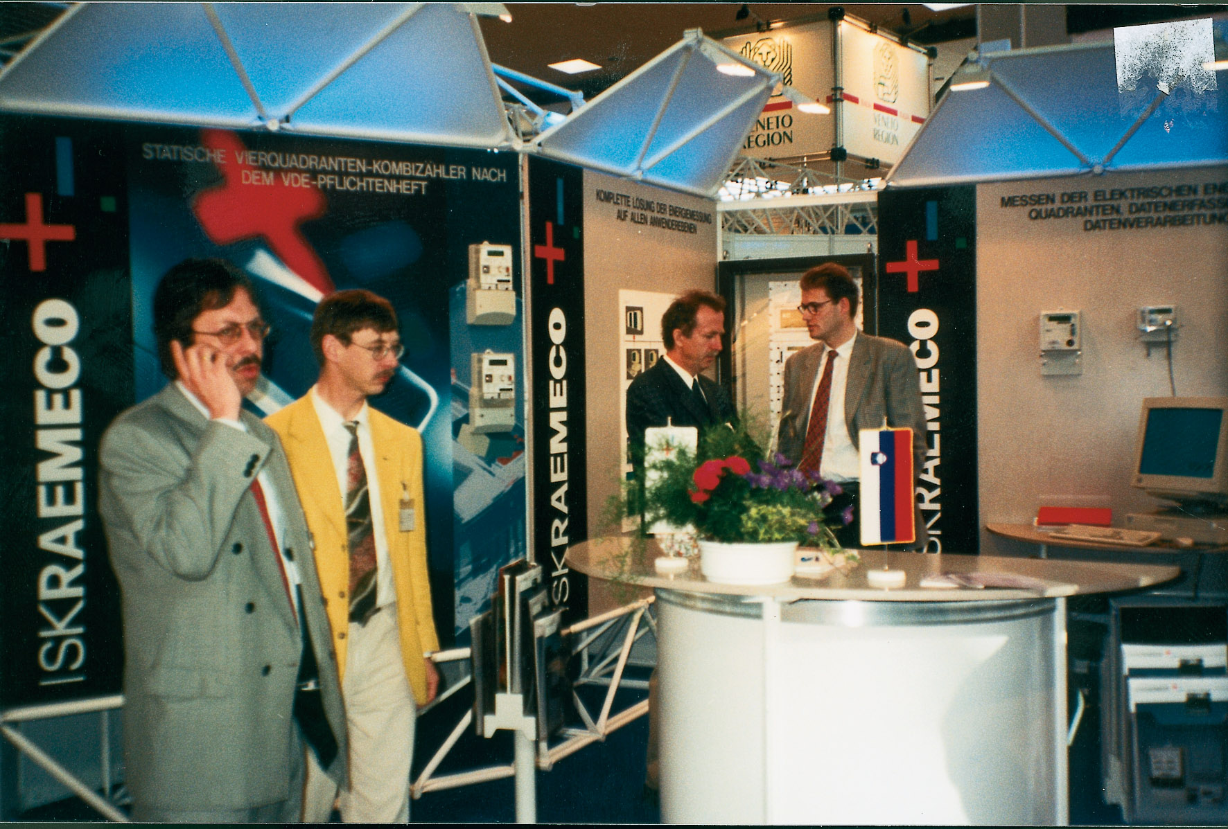
In the early 1990s, the company—then known as Iskra Števci—underwent a rebranding. The name Iskraemeco was introduced by Stanislav Tadina, then director of the electronic meter division. It stands for Energy Measurement Company, marking a major milestone in the company’s evolution and highlighting its dedication to innovation and precision in energy measurement.
The corporate image of the newly-named company was designed by Miljenko Licul, an acclaimed Slovenian designer, in 1995. The logo consisted of a point, from which the company linearly grew and transformed into a three-dimensional plus sign. Another interpretation of the plus, minus and point featured in the logo was that Iskraemeco’s products provide decimal point accuracy, in plus and minus tolerances.
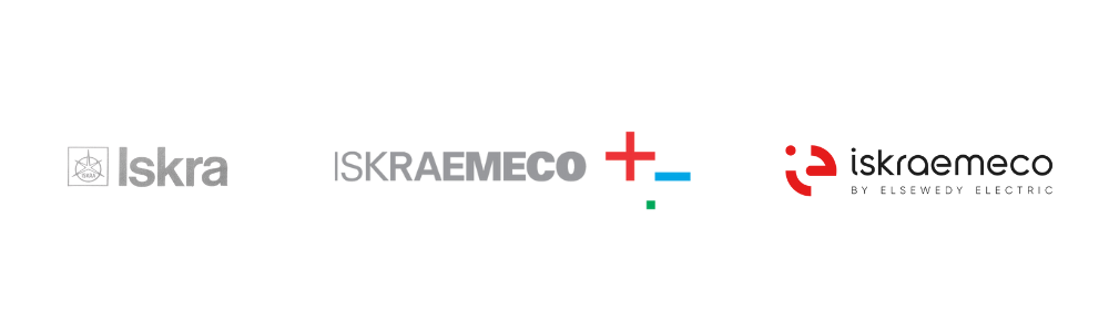
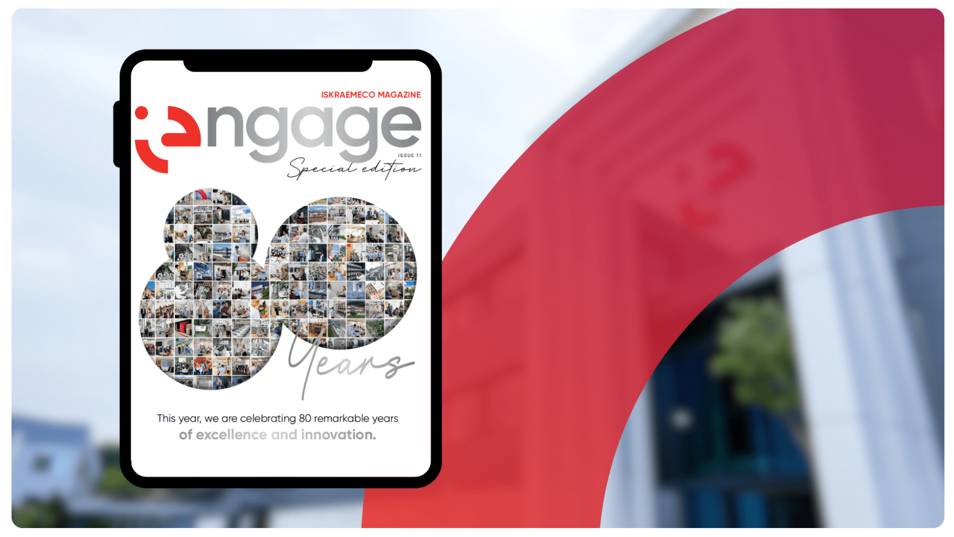
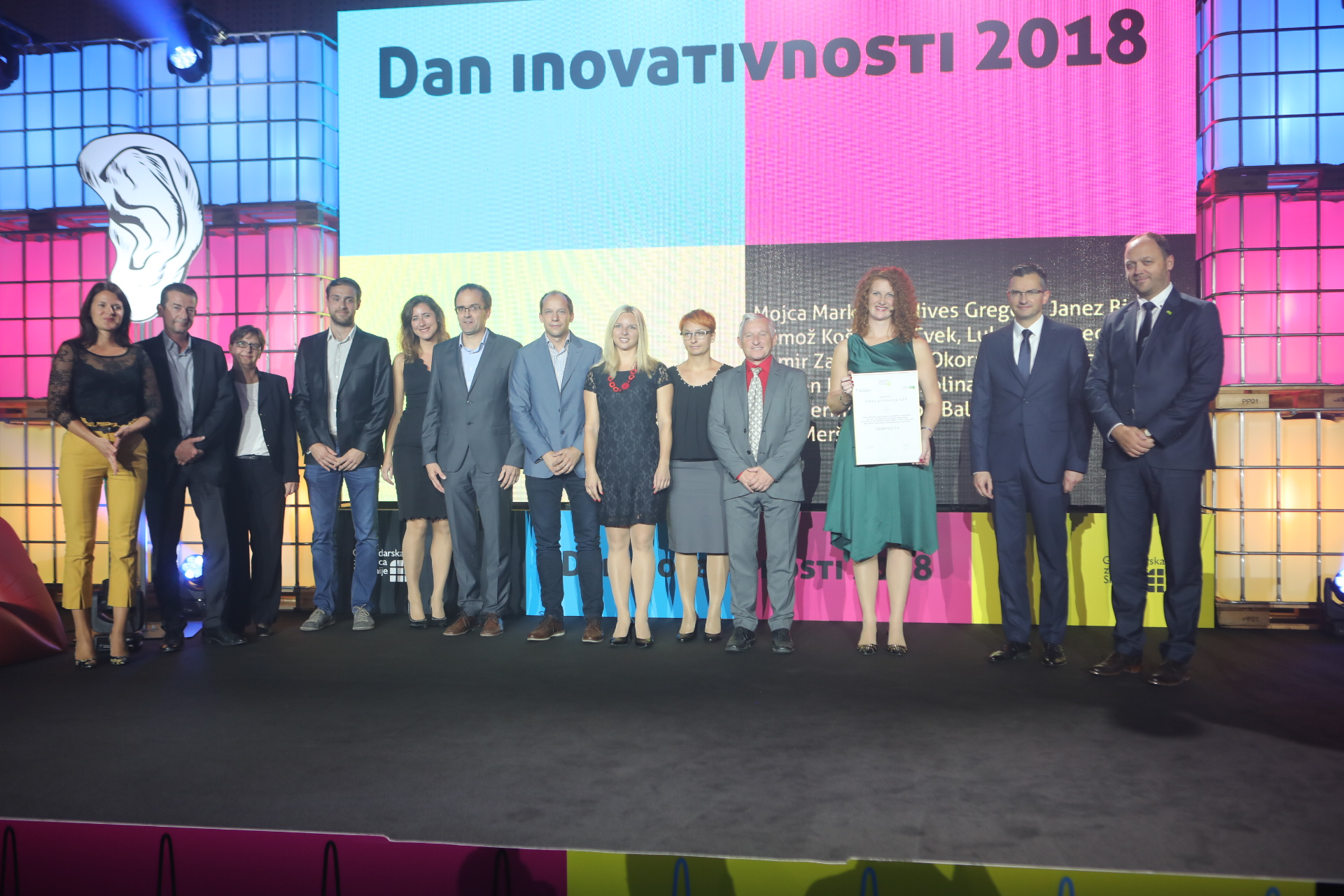
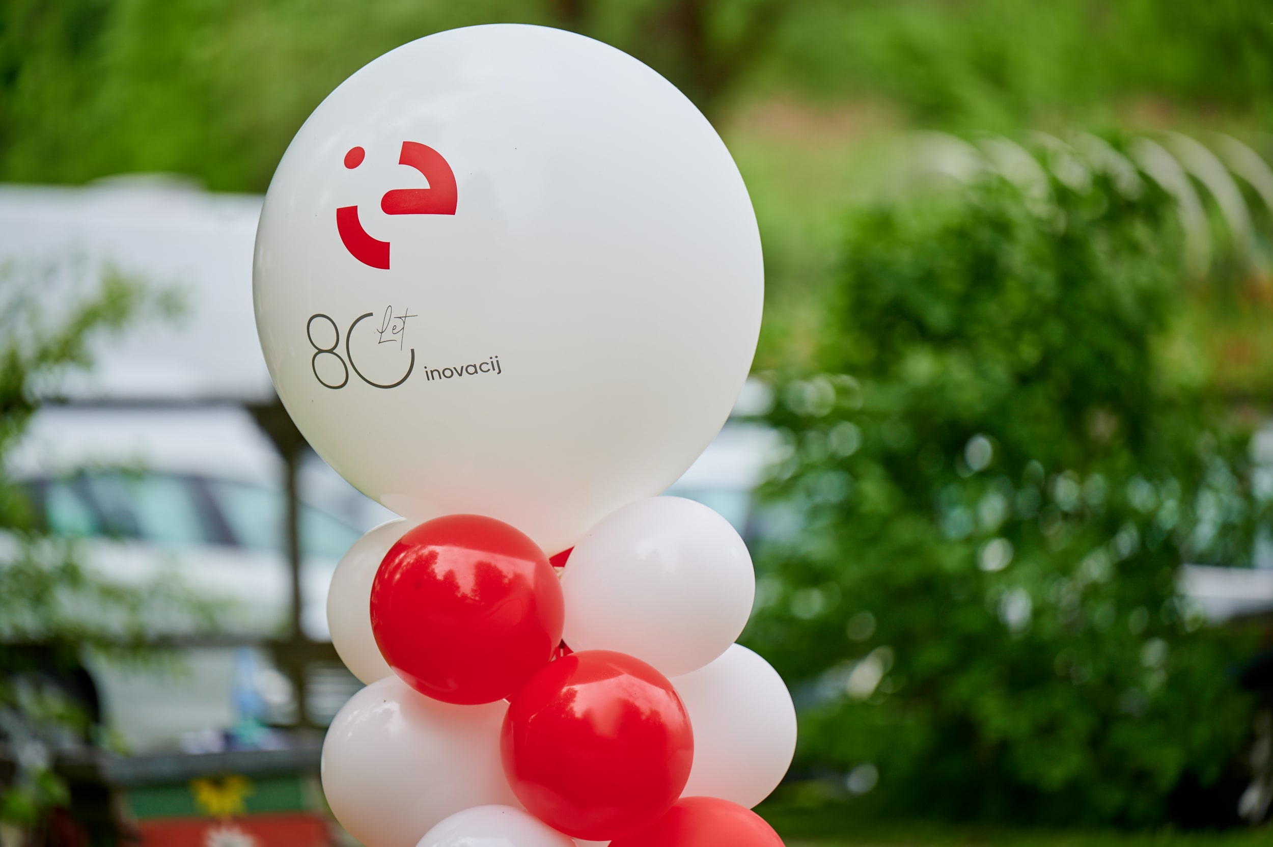
In celebration of its 75th anniversary in 2020, the company introduced refreshed visual identity. As Iskraemeco stepped into a new era, it reaffirmed its commitment to co-creating a more sustainable future through innovation, promoting the circular economy, and delivering intelligent solutions to the challenges faced by utilities and energy systems. This vision is embodied in the redesigned corporate image.
The meaning of the abbreviation IE is two-fold: firstly, IE is an abbreviated form of the name Iskraemeco, and secondly, it is a promise of bringing intelligence and innovation to the utilities and energy industry. The circular design of the central element of the logo implies cyclic movement, circularity, recycling and sustainable development. Red is the color of energy and determination, and the company’s name written in formal black portrays the serious nature and strength of the corporation.